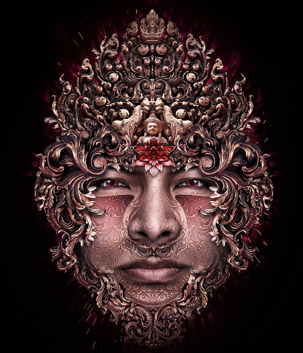
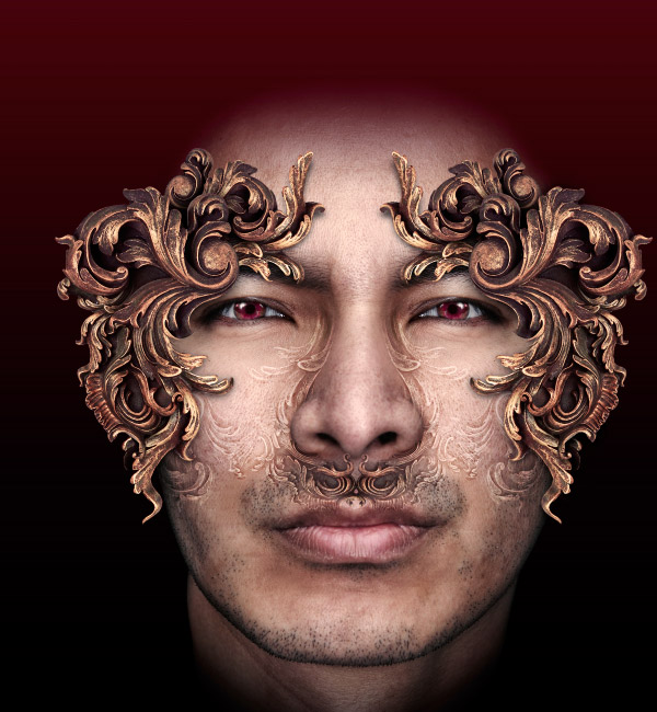
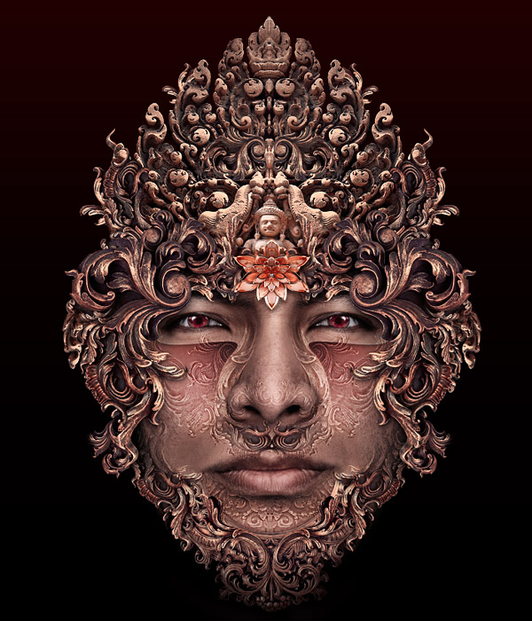
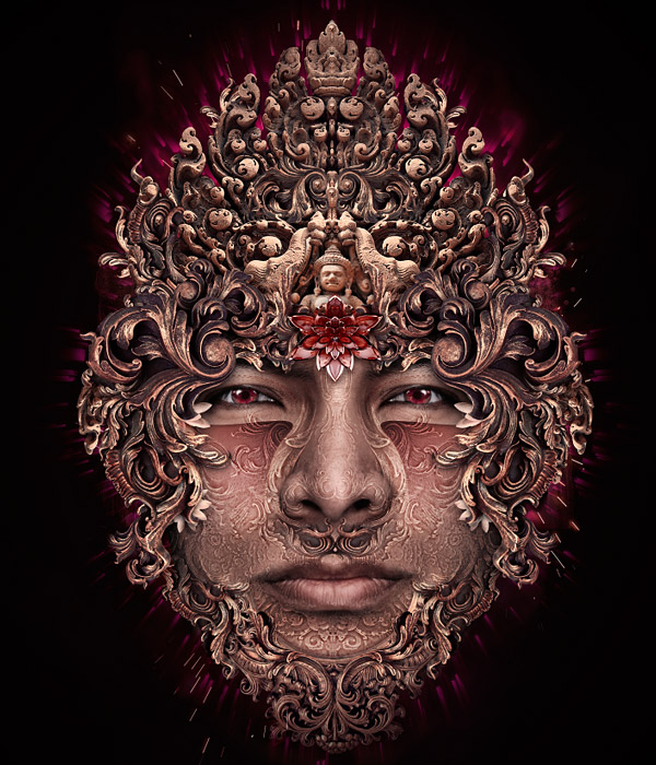
Introduction
Hello everyone, before we get down to actually starting any Photoshop work I thought I would say a few words. Since this is a fairly long article, there are some points I need to make on what to expect from it, how it differs from the majority of tutorials, and my philosophy on tutorials themselves.
First, and most importantly, I should state that this is by no means a tutorial for beginners. I would say that at least an average level of Photoshop knowledge is needed, as well as a fairly good understanding of Photoshop terminology. I will explain how to do things, or give keyboard shortcuts for the less common commands, but won’t be explaining how to run a Gaussian blur, or how to select a layer. If you need to know how to do these things you are reading the wrong tutorial!
Basically, the idea behind this tutorial is to document the process I used while making this image from start to finish. Now this probably means it doesn’t qualify as a traditional tutorial at all, as I had very little idea of what the end result would be when I started. Consequently, there are steps taken to produce effects or changes that might not actually be included in the final image, as I decided to remove them at a later stage. I might also seem to do things in a rather odd order. This order is just how things occurred to me, rather than every step having been planned prior to getting started.
Realistically, it would also be almost impossible for me to record every single action I make while producing an image. Not just because it would result in about 5000 steps, but also because it would completely disrupt my working process trying to note everything down. I’m sure like me, you would find it very difficult to create a cohesive image if you had to keep stopping every couple of seconds to write something down! I have however included all of what I consider to be the important steps and techniques.
Another way in which this article might differ from a more traditional ‘recipe’ style tutorial is the lack of precise instructions. You won’t find much like ‘now add a glow of this exact color, this size, this opacity’ or ‘now run a filter with these exact settings.’ There are a couple of reasons for this. The first is that I think this approach is unsuitable for an image like this that utilizes many different techniques. It’s fine for a method on how to reproduce an exact text style, or icon design, but not here.
Secondly, I feel that many decisions such as what color to use, how light something should be, or how blurry is really down to individual artist’s taste. I could tell you the exact hex codes of every color I’ve used, but I’m sure that everyone would have different ideas of what they think looks good. I try to give instructions where I think they are needed for the process being discussed.
So in summary, this isn’t the sort of tutorial you can follow like a cookbook and end up with the same image as me. However, I hope that by explaining my methods you will be able to pick up some Photoshop skills, and learn about parts of the program you didn’t know before.
Since, during the course of producing this image I will be using similar methods repeatedly, I will only give a full explanation the first time. Rather than repeat the steps I use for e.g. photo extraction ten times, I will describe them once, and from then on simply say ‘extract the photo.’
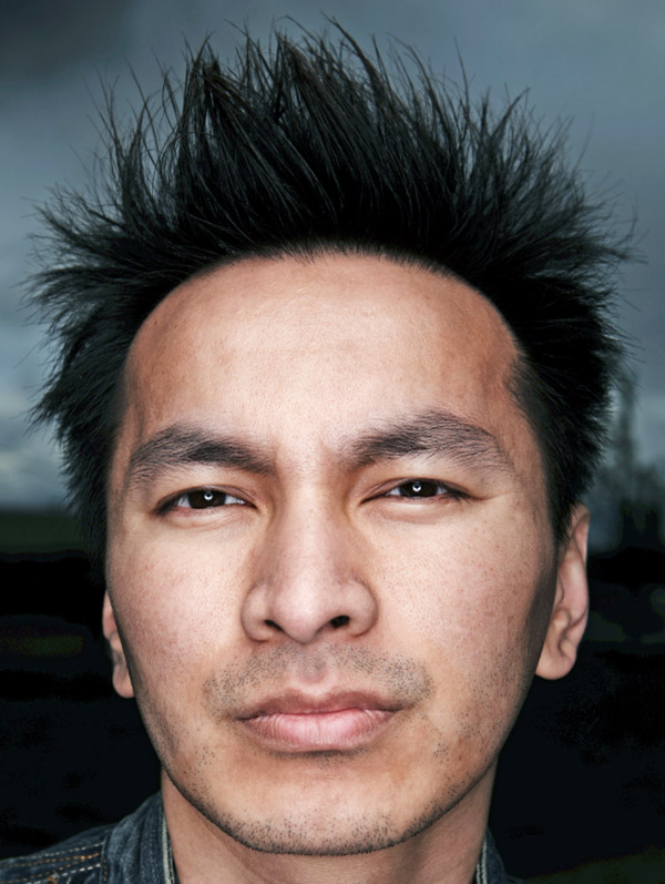
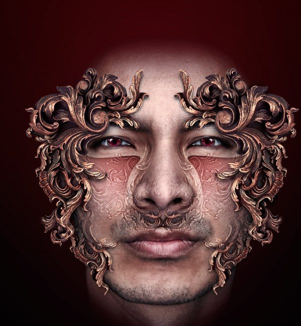
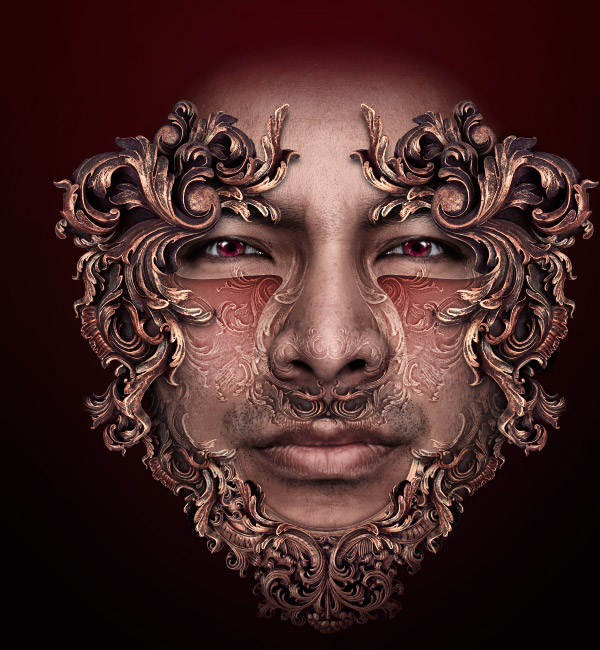
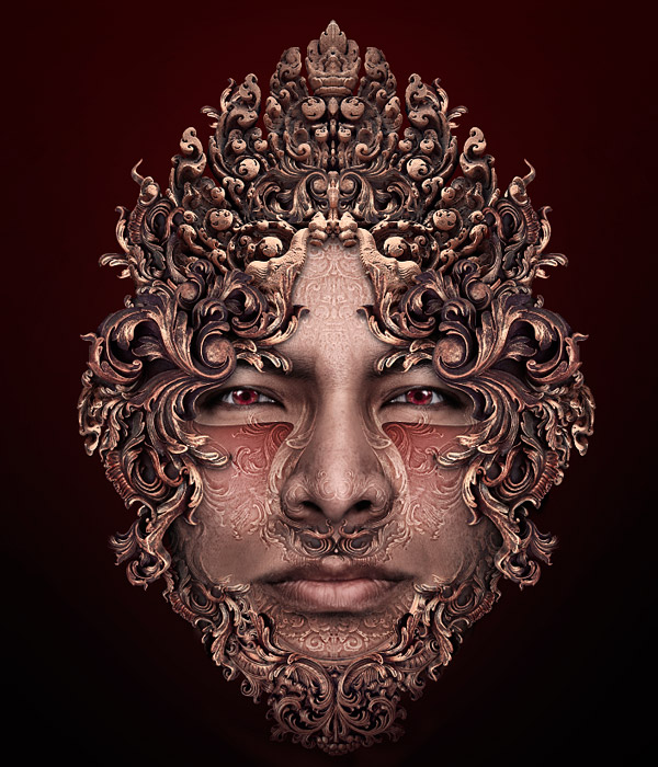
Anyway, it’s time to start thinking about creating this image. Here is the photo I started with; I got it from iStock. I will be combining this with other photos which I will show as I introduce them.

With a photo-manipulation based image like this, finding good photos to work with is absolutely key. I can look at up to 10,000 photos just to find the right one that I am willing to pay for, which is of good quality. It doesn’t matter how fancy your Photoshop skills are if you are working with poor photos. Spend the time here and it will show in your final image. If you need somewhere to find photos, I find this site excellent for all sorts of graphic resources: Bluevertigo.
Right, enough of that. Let’s go.
Step 1
Chances are you will need to do some work to your photo before starting, even if it is of high quality. My photo is of a good size to use as my canvas, so I am happy to just open it up in Photoshop and work on it directly. Its size is 2912 x 4368 pixels. Working at high resolution gives greater control, and will allow the image to be printed at a decent size in the future if needed.
The first thing that strikes me is the image is too dark. To sort this out I run a shadows/highlight adjustment on it to bring out the dark sides of the face without completely killing the contrast.
Next I want to neutralize the color cast of the image slightly, so I perform a color balance adjustment. I add some more blue, cyan and green into the image until I find the skin tone a more pleasing color. Since I will be getting rid of the background, hair, and clothing, the face is really the only part that I am concerned with here.
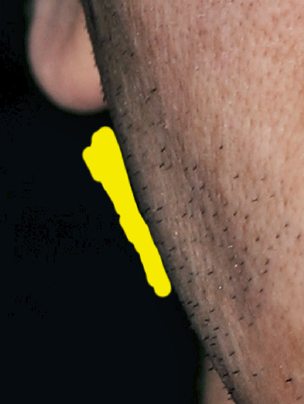
The final thing I do is to clone tool out his few freckles/spots. I find them distracting and unnecessary. Use the healing tool if you like, but I find the clone tool a lot more reliable.
Step 2
Now for the almost inevitable step that every photo-manipulator hates, extraction. I want to cut out the background so it doesn’t distract me. I can replace it later if necessary. Now there are endless ways to extract an image, and which one to use really depends on what you are trying to cut out. In this case, I have a fairly irregular shape but nothing overly complex. That means I can’t just do it by hand.
First, I create a layer behind my photo and fill it with a bright color (yellow here) that contrasts sharply with it. This is so that when I start cutting him out I will see very easily which pixels I am hiding. I then add a layer mask, zoom in, and start tracing around his face with a small brush. Since I plan to cover up the hair and neck, I just roughly cut these out for now. No point tracing carefully around something that’s going to be hidden anyway.
For a bit more detail on this method of extraction, here’s a very old tutorial of mine that should still be helpful: Extraction
Step 3
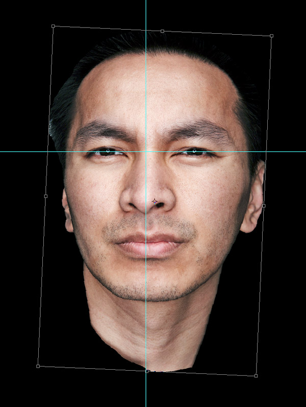
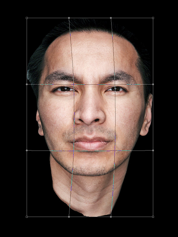
Once I had extracted what I wanted, I changed the yellow background layer to black as I wanted this image to have a dark background. The face is leaning a bit so I wanted to rotate it to a better alignment. To help I added a couple of guides. Then I lined up the eyes and nose with them as best as I could.
Step 4
I also wanted to turn the face to look at me so it is more symmetrical. To do this I used a warp transform to pull the face into a better alignment.
Step 5
Now although I don’t want the face to be perfectly symmetrical, I did find the right (his left) eye a bit too closed. I decided to replace it with a reflected version of the other eye. To do this took a few steps.
First, I duplicated the face and reflected it horizontally using the transform tool. I then dropped the opacity down and aligned the reflected eye over the one I wanted to replace before putting it back to 100% opacity. I then added a ‘reveal none’ layer mask (hold down ALT while Clicking the add layer mask icon). Then, using a big soft brush, I brushed white onto the mask over the old eye to reveal the new eye. This way I made sure the new eye blended in nicely.
PS I have added a gradient to the background here. There was no particular reason to this, just one of the many little things I do while making an image depending on how I feel. You’ll notice more small irrelevant changes like this throughout the article.
Step 6
I also decided that his eyes were a little too puffy, and so smoothed the skin out just below them. To do this took a few steps as well.
Basically, I cloned skin from his cheeks up to just below his eyes. However, the skin on his cheeks is actually lighter, although it may not look it, so a straight clone would not work. The healing brush also failed here so it has to be done manually. First, I duplicated the face layer, and very roughly cloned skin from his cheeks upwards so that it covered all the area I wanted to smooth.
Next I added a reveal none layer mask and dropped the opacity to 50% or so. This opacity change is because I didn’t want to completely remove the folds beneath the eyes, as that would look odd. Next I brushed white onto the layer mask over the areas I wanted to affect. This looked a little too light so I slightly darkened the top layer using a curves adjustment (pull the middle of the curve down slightly). If there had been no difference in lightness between the two areas, I could have done this all in one step with the clone tool. This method works where lightness/colour adjustments are needed though.
Step 7
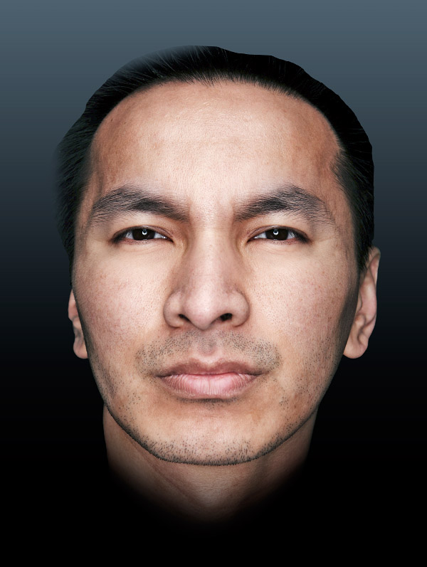
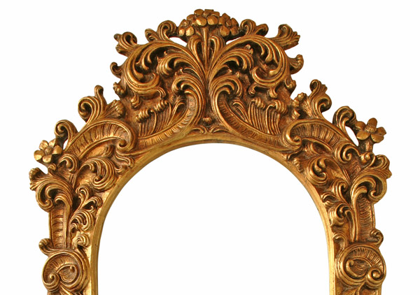
Wow, so after all that the main image is basically ready for use (hah! I wish, as you will see I have to make more adjustments later, but it’s good for the moment). Now it’s time to bring in our next photo. This is another high resolution image, approximately the same size as the first, from iStock.
Step 8
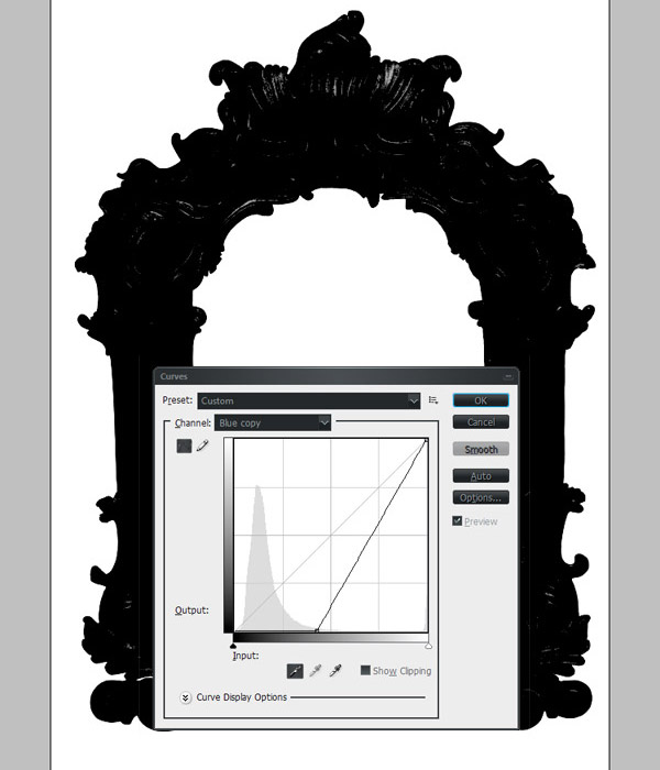
As before, I needed to extract this photo to make it ready for use. With an image set against a flat background like this that job is slightly easier. I find the best way to do these extractions is to use the RGB channels. I took a look at these channels to see which had the most contrast between the background and object, in this case the blue channel.
Next I duplicated this channel. Then in the curves adjustment window, selected the set black point dropper, and chose a very light grey. This changed every pixel from that light grey and lighter to black. I tend not to choose the lightest grey possible, as this results in very jagged edges because you basically cause aliasing. To make sure that you are getting all of your image requires a little more work.
Tip: If you do end up with jagged edges in your channel, there is a way to help smooth them out. Run a series of very light Gaussian blurs (1 pixel or less) on your channel. Then using a levels adjustment, pull the two outer sliders towards the middle until your channel sharpens up again, but stop before it gets jagged. Be careful though as this method can cause the smoothing of corners as well so fine details might get cut out of your selection.
Step 9
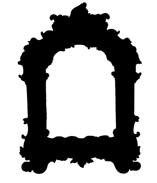
Using the magic wand tool, I selected the big white areas outside and in the middle of the frame. I then inverted this selection, contracted by a couple of pixels, and filled the resulting selection with black. I now had a perfect black shape in the parts of the image I want and white where I didn’t want it. This is actually the exact opposite of what I want, as white represents the bits of the image that will be selected, so I had to invert this channel. I then CNTRL + Clicked on this channel to produce a selection. Then making sure the RGB channel was active, copied and pasted into my main document.
Step 10
Ok, so I now had my second photo cut out and in my main document. The first job here was to clean up the extraction.
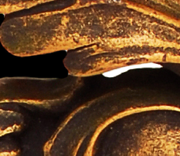
Extraction can often leave a ‘haloing’ effect where the background is just visible around the edges of the object. You can try using a defringe command to clean this up, although I find the results of this only good on small objects. On a very high resolution image like this, the best result is simply to cut off the outer 1/2 pixels. To do this I got a selection based on the shape of my object (CNTRL + Click on the layer thumbnail), contracted by 2 pixels, and then added a layer mask.
I then brushed black onto this mask to remove little bits of the background that had been missed by the extraction. As shown here, a little bit of the white background can be seen through the object itself. It’s best to clean things like this at the start before you go duplicating the object a lot and have to fix them all later.
Step 11
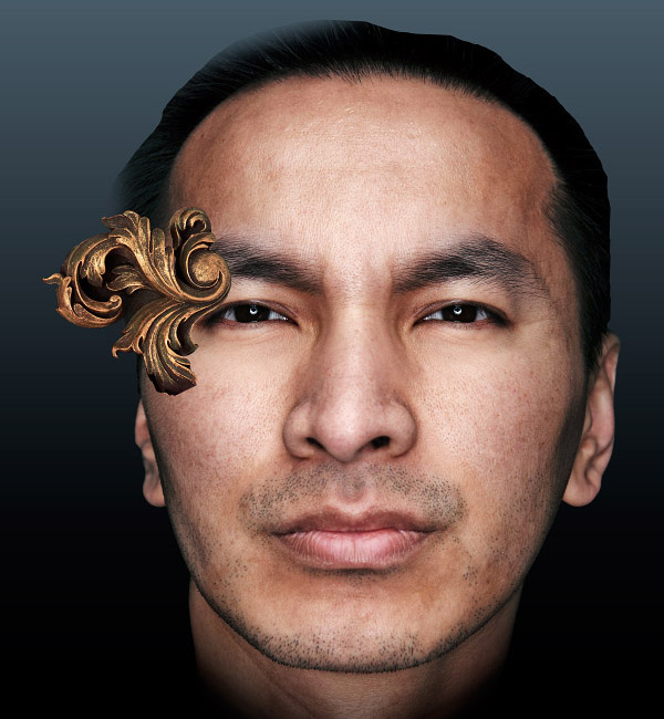
Now I needed to decide where exactly I wanted to blend this image into the face. The first thing I did was to duplicate my new object (let’s call it the frame from now on) and hid one of the layers. It’s good to keep a backup of important objects like this in case you need to use it again.
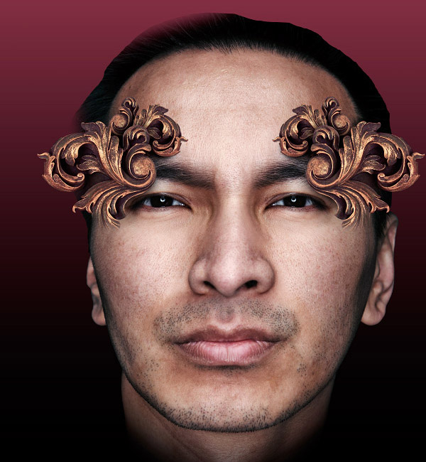
Next I chose a part of the frame I was interested in, and very roughly masked it off. I then moved it around, resized and rotated it to see what it looked like in different positions. I decided that one on either side of the face above the eyes looked good.
Step 12
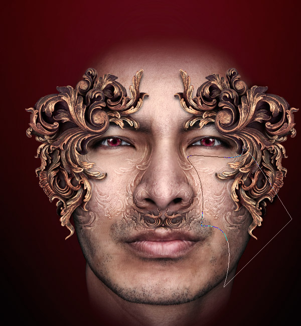
Once I had decided on the part of the frame I wanted, I needed to cut it out properly. I got rid of the rough mask, added another, and this time traced around it carefully.
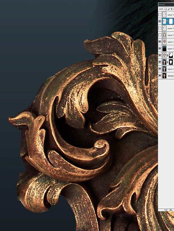
Step 13
Now here’s a little trick that can be used when masking like this to get a clean result. Sometimes it can be difficult to tell whether you’ve left any stray pixels when masking, even if you look directly at the mask itself. By simply adding a stroke layer style (standard settings are perfect) these rogue pixels instantly shown up. Even a single pixel which is only 1% opaque will have a stroke added making it obvious. You can then quickly whizz over them with black on the layer mask.
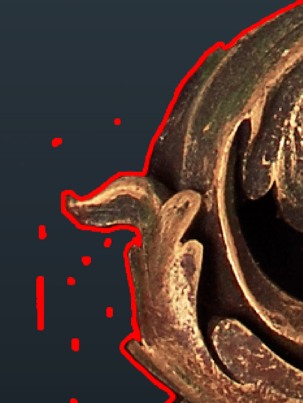
Step 14
Ok, so I’ve got a nicely cut out object now, although the bottom is a little bit odd. This is actually down to the image though as there was no nice edge to cut to.
Step 15
To sort this bottom edge out I added a layer mask (after applying the previous one used to cut the object out), and started softly brushing black over the bottom area. I used the smudge tool to push the black upwards into the layer to make it slightly less uniform.
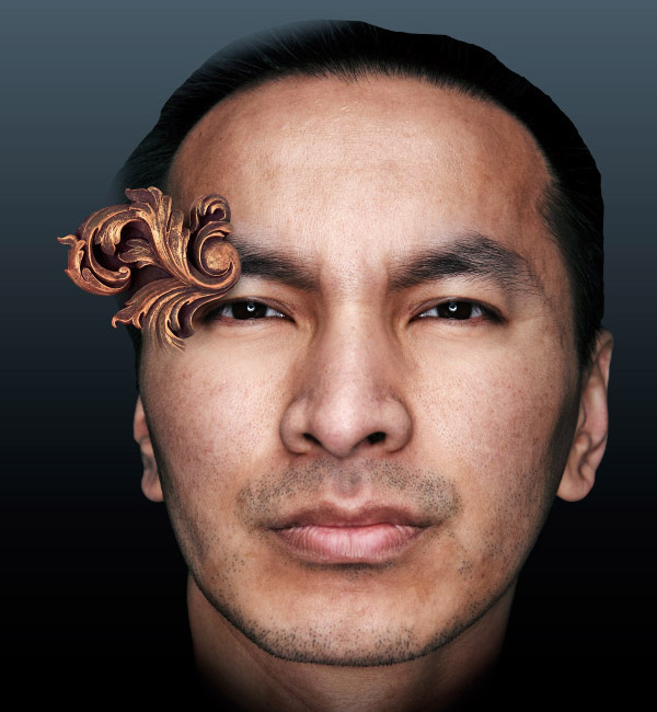
This image also needed a bit of adjustment to match the overall lighting and colors of the image. The steps I took to fix it are as follows. First, a very light shadows/highlights adjustment to bring out some of the darker areas. I then performed a selective color adjustment, and reduced the amount of yellow in the yellows themselves. Finally, I used a color balance adjustment to add more red and magenta in. This brings the colors closer into line with what I think suited the image.

Step 16
It’s important in photo manipulations like this to add shadows and shading between layers to build up a proper sense of depth. Generally, I tend to brush softly onto layers with black (or more often a dark color chosen from whatever object is casting the shadow). Sometimes a quicker method is what I used here.
I created a new layer below the part of the frame I had just been working on, selected the outline of the frame, and filled it with black. By the way, to select the outline of a layer with a layer mask, CNTRL + Click on the layer’s thumbnail. Then hold down CNTRL + ALT + Shift and Click on the layer mask’s thumbnail.
I then blurred this layer. A smallish Gaussian blur followed by another faded to 50% multiply did the job (CNTRL + Shift + F to use the fade command, possibly the most useful command in Photoshop in my opinion). I then used a warp transform to pull this shadow down slightly so it sat underneath the frame. At the bottom where I have faded the frame off, I didn’t want the shadow, as this is where the frame is meant to be blending into the face. I added a layer mask to the shadow, and softly masked off the shadow around this area.
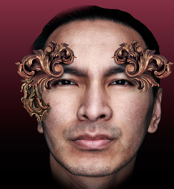
Step 17
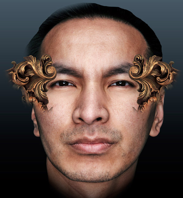
Now things started to move a little bit faster. First, I linked my frame part and shadow layers together and put them in a layer group for quick manipulation. I then started to play around with duplicating, resizing, rotating, and moving them around to create more complex shapes. Here you can see how the face looks like four copies of one object on it.
I should note here that when producing a symmetrical image like this, it would be very easy just to do half of everything and flip it over at the end. However, this can produce an overly perfect looking image that then seems fake. I do nearly all the symmetry by hand, and don’t bother measuring or anything like that. Just place things where they feel right.
At this point, I also decided that his nose was too off center for my liking. I slightly moved it to the right using a very similar method to replacing the eye (duplicate, move, blend).
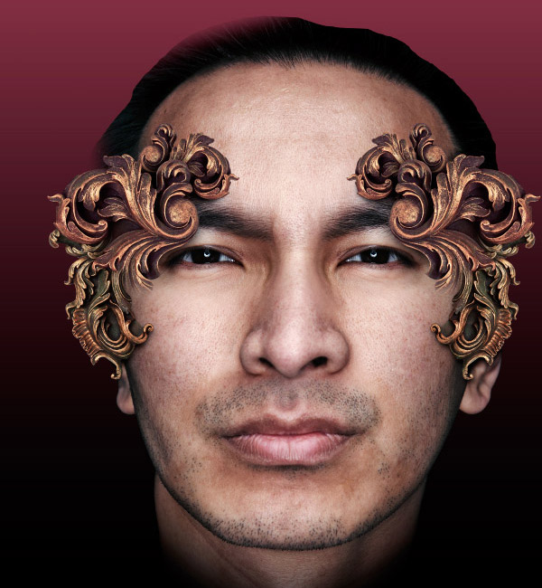
Step 18
Time to add some more shapes into the mix. Here is another piece of the frame roughly brought in as before.
I often add adjustment layers at the top of my layer stack while working to bring quick color changes to a whole picture. It can help unify the various pieces of an image and give them a sense of cohesion. Which type of adjustment layer I use depends entirely on the image, but the most common ones I use are: Curves, Color balance, Gradient map, Photo filter, Hue/Saturation and Selective color. For this image, I added a gradient map adjustment layer at this point using a dark blue to white gradient, set to a soft light blending mode with an opacity of about 20%. This helped add contrast as well as soften the oranges and yellows.
I added quite a few different adjustment layers during the making of this image at different times. If the image suddenly seems to change color or lightness subtly then that was probably when I added one.
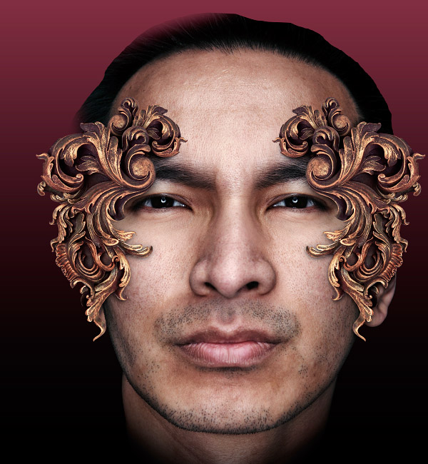
Step 19
Properly extracted and duplicated this new piece is beginning to fit in nicely. You might be able to see where I tried to match some of the curving elements on the two bits of frame, so they appear to join up nicely. This helps make the photo blending more seamlessly.
Step 20
Now I added a third piece from the frame. Colors have been matched up and shadows added to make the pieces fit together nicely.
Step 21
Now I was adding pieces continually, using the three different parts I had cut off the frame. All I had to do was resize, rotate, or distort them, and place them where I think looked good. I also decided to mask off the guy’s ears at this point as they were just getting in the way.
I also decided I want some subtle patterns on the skin in the same shapes as the main frame bits I’ve been adding. There are many ways this could be done, but I decided on using the highpass filter, combined with a blending mode. The highpass filter is a good way to ‘neutralize’ everything but the edges. Basically, it will retain the high contrast edges while changing the other areas to mid level color. When you combine this with a soft light or overlay blending mode, which ignores mid level colors, you have a way of keeping the edge details.
Here is what one of the frame pieces looks like after being run through the highpass filter and desaturated (I didn’t want any color tingeing on the skin either). This is the sort of detail to aim for, not too sharp, but not too blurry. A 10 pixel or so setting worked here.
Step 22
Here, the blending mode of the filtered piece has been changed to overlay, and the opacity dropped to about 60%. The result is the highlights and shadows of the shapes appear on the skin, but the areas between are left unaffected.
As with the main shapes, I repeated this for different parts of the frame, and continued to move and transform them around the face. Since these shapes are using a blending mode, it’s important that they didn’t overlap. This would end up producing a muddy, blurred look.
Step 23
At this point the guy’s face was bothering me, so I made a few changes. First, I roughly masked off the top of his head, as it was distracting, and I think I wanted to replace it later anyway. Then I realized the mouth needed lining up with the nose, so I slightly moved it to the right using exactly the same method as with the nose.
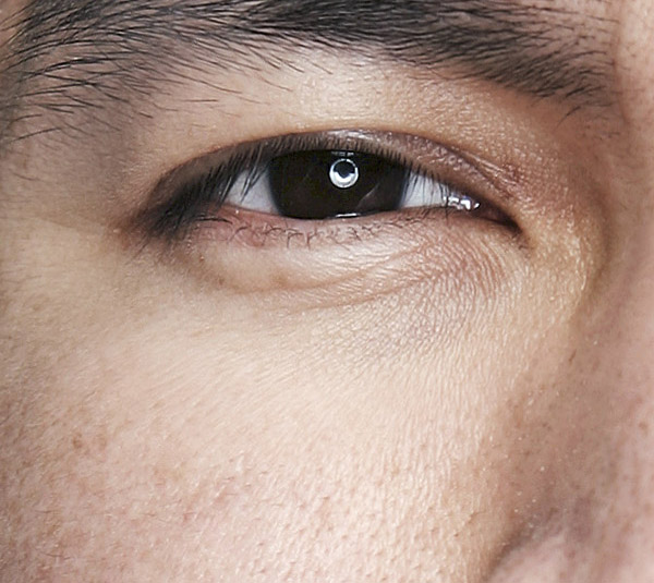
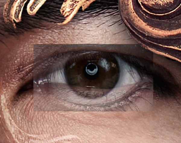
I then decided I didn’t like the eyes either. They were just too dark and were sucking the life out of the picture. In cases like this, where the eyes are actually just pure black, there is no good option but to replace them completely.
I found a suitable eye photo from my collection, roughly cut it out and stuck it in.

Step 24
To make sure it lined up properly I dropped its opacity to 50%. Then I resized and moved it around until both the old and new pupils lined up. This is the only part I was really interested in replacing, so that’s all that needed to be done.
Once the eye was lined up, I put the opacity back up to full, and added a reveal none layer mask. I then softly brushed white onto the mask to reveal the new pupil.
Step 25
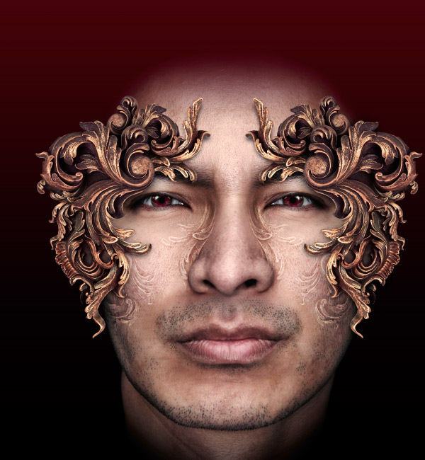
I repeated the process for the other eye. The new lightness of the eyes was much better, but the color was a bit dull, so I changed them to red. A combination of hue/saturation and color balance adjustments is a good way for hefty recoloring like this.
Step 26
Again, there was something bothering me about this guy’s face. This time it was the tip of his nose, which was still pointing off to one side. A quick trip to the liquefy tool, and I pushed it into the center.
The piece I added under the nose is made from one of the same three shapes I cut from the frame. However, here I mixed both the first technique (straight paste) and second (highpass filter). To do this I first moved the shape into the right place, and then duplicated it.
I performed the highpass filter procedure on the bottom layer, and then added a layer mask to the top layer. I then used a black to transparent gradient and dragged it onto the mask from the areas I wanted to hide towards the areas I wanted to keep. This way the shapes slowly fade from solid into the subtle tracery.
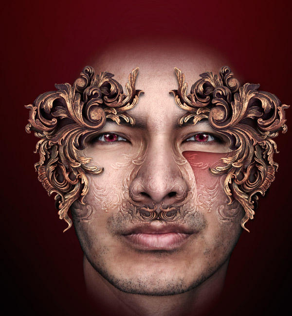
Step 27
As well as adding some more subtle patterns to the nose, I now wanted to put some large areas of color on the cheeks. I quickly drew out a shape using the pen tool, and converted this into a selection. I intersected this with the face to make sure my new shapes wouldn’t go over the background (CNTRL + ALT + Shift + Clicked on face’s layer thumbnail).
Step 28
On a new layer above the face, I dragged a red to transparent gradient from the top left to bottom right. I then changed the blending mode of this layer to linear burn to blend it better. This looked a little flat so I decided to add some styling.
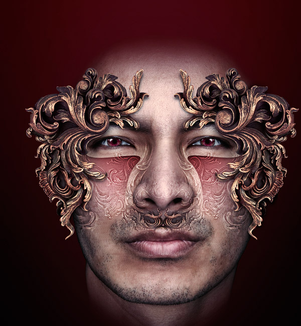
To do this I decided on layer styles; however, trying to add styles to a layer with soft edges like this new shape can produce awkward results. Much better to use a layer styles dedicated layer. To do this I selected the shape’s path I drew, and converted it to a selection again. I then created a new layer above my red shape and filled it with black (although it doesn’t matter what color you use). I then changed the layer’s fill (not opacity!) to 0%. This allows layer styles to show while nothing in the layer itself actually appears.
I then added an inner shadow and outer glow to add a bit of definition to the red shape. To mask off the bits of these new styles I didn’t want, I made sure layer mask hides effects was ticked in the layer styles window, and used a layer mask like normal.
Step 29
I linked these two shape layers together, and stuck them in a layer group for ease. I then duplicated this group, and reflected it horizontally, before moving it over to the other cheek. At this point, I added another adjustment layer to add more blue to the shadows, as well as increase contrast.
Step 30
Not much to say here, I just added more of the same shapes to the side of the head using the same blending method as for those below the nose. I reduced the opacity of the cheek shapes a bit as well, as they were slightly too distracting.
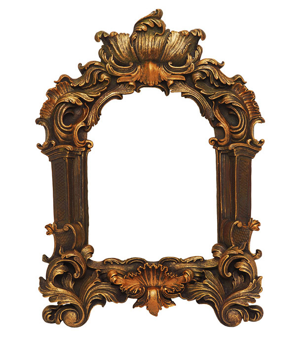
Step 31
I wanted to add some new shapes now before these ones started to get too monotonous, so it was time to bring in another photo. This is another picture frame photo from iStock. I was only interested in the very top of it, as shown below. Extraction and color fixing were identical to the first frame photo.
Step 32
I pasted the new frame underneath the old ones, flipped it upside down, and masked off the parts I didn’t need. Color matching was a little more complex here, but nothing a custom created gradient map couldn’t fix. The shadow I added here was small, as I wanted it to appear to be very close to the face. A drop shadow layer style sufficed for this.

Step 33
I wanted this new style of frame to blend in with the first, which it didn’t quite. To help this I blended in a couple of pieces from the first frame over the top of the new one. I used a layer mask and a soft brush to blend them together.
Step 34
At this point, I decided the whole face needed to be brought in line with the colors of the frames a bit more. To do this I did a hue/saturation adjustment, choosing colorize, and selecting a dark orangey/brown.
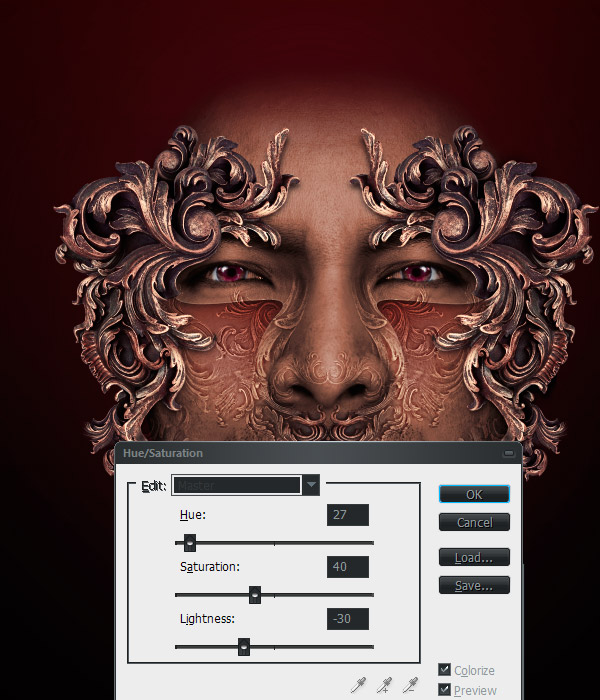
Step 35
I then faded this (CNTRL + Shift + F) to 30%, as a full colorization always looks rubbish. Keeping a range of colors is important.
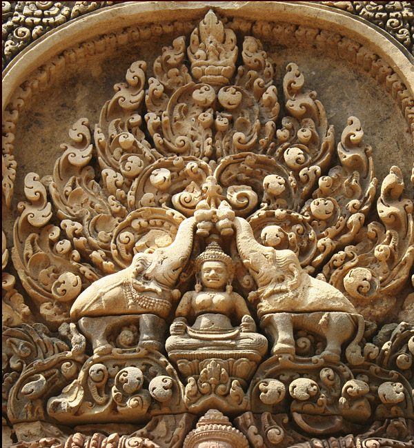
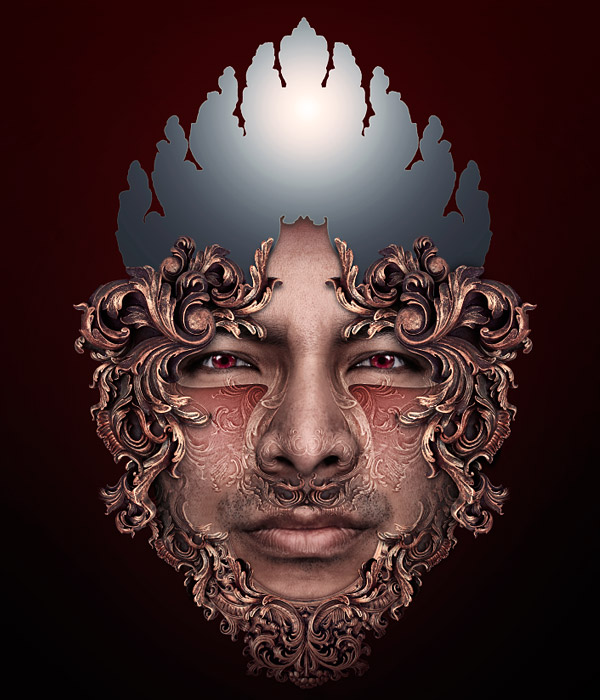
Step 36
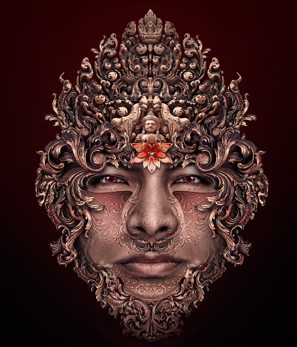
The top of the head had been bothering me for some time by then. I wanted some new shapes to add up there, something like a crown with an Eastern feeling. After a fair amount of searching, I found this image on iStock.
Step 37
Before starting on the laborious job of extraction, I roughly comped in the new photo with a very rough extraction and color fix.
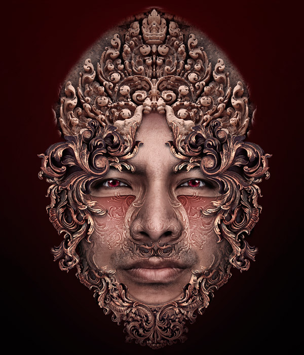
Step 38
Liking what I saw, I extracted the image properly, this time using the pen tool, as I wanted to preserve the nicely curved edges.
Step 39
Fixing the colors was again quite a bit more challenging than with the first frame. A good custom gradient map and repeated use of the color balance adjustment was necessary. Although you can’t see here, this photo was not overly well focused either. To affect a heavy sharpen I ran the highpass filter over it with a setting of about 3 pixels. Then I faded the filter with an overlay blending mode. This helped bring it back into focus.
Step 40
I also felt that the distribution of light over this new piece, which I will call the crown from now on, was too even. I wanted the focus to be more central. To help this I selected the outline of the crown and created a new layer. I then created a white to black radial gradient from the top center outwards. I then changed this layer’s blending mode to soft light, and adjusted the opacity until it looked good.
Step 41
As with the chin piece, I wanted the new shapes present in the crown to blend more with the shapes already present. I copied parts of the crown, and moved them to near where the ears would be, behind the frame shapes. I also used the highpass method on a duplicate of the crown to add some more tracery to the chin and forehead.
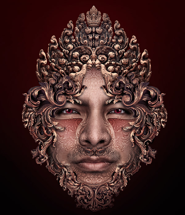
Step 42
To continue with this matching of shapes, I started to blend some parts of the first frame into the crown. I added some shapes around the edge and behind the crown to enhance its outline. I then blended some of the very first shapes (the shapes I had cut out directly) onto the front of the crown. I felt now that it was more in tune with the rest of the design work.
Step 43
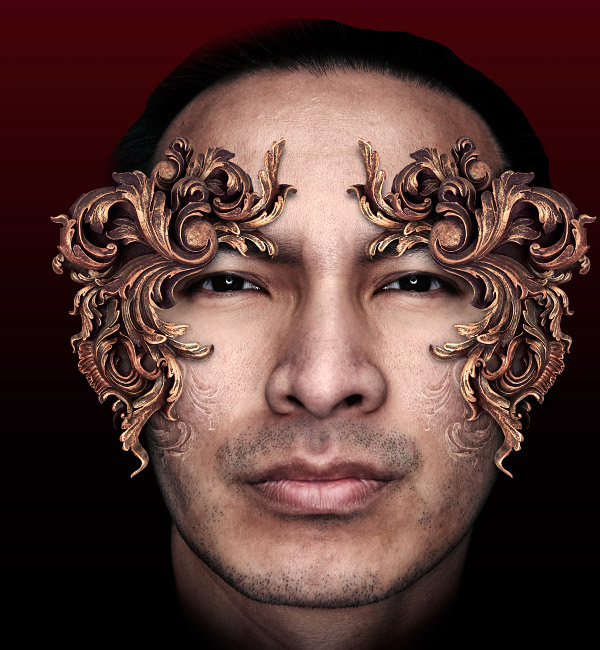
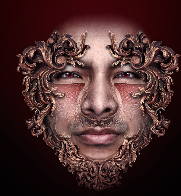
It was about this time that the stubble above his lip started to bother me. It seemed out of place. To fix this, I simply repeated the method I used to reduce the puffiness below his eyes. This time I cloned skin from his forehead, and used a slightly higher opacity on the new layer to override the stubble.
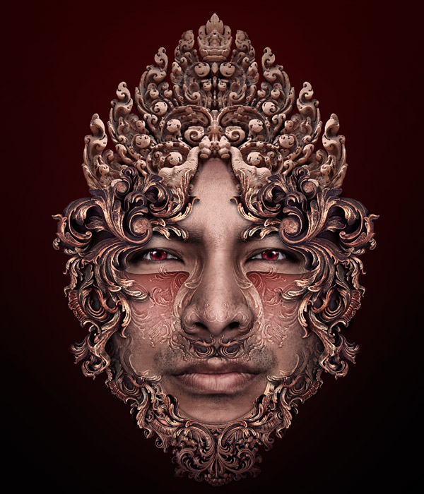
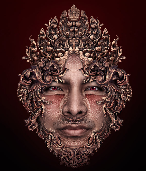
Step 44
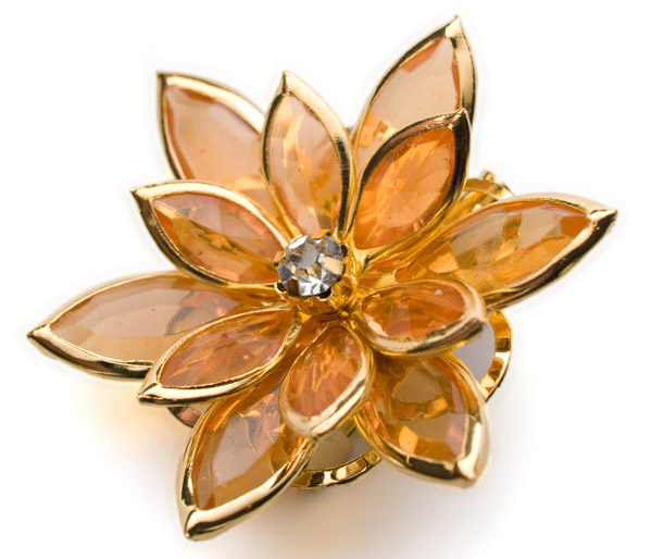
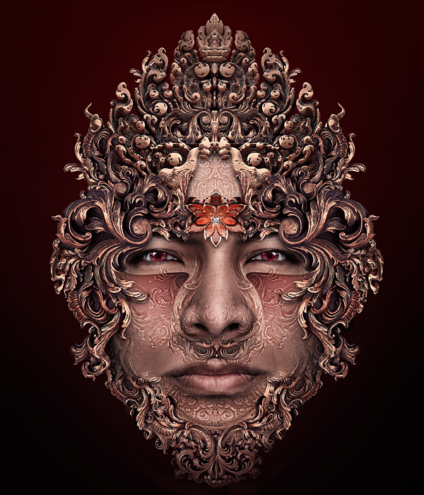
I felt the gap in the center of his forehead was a bit boring and wanted to add some more focus. I thought a jewel would be a nice touch, so went off to find a decent photo. I chose this one because of the lotus-like shape it has, which would continue with my vague Eastern theme. Again, another iStock image. I should get commission from them!
Step 45
I extracted the jewel using the pen tool, and pasted it into my main document. After resizing and rotating it, I decided that it looked a bit too lopsided. To fix this I deleted one half of it, duplicated the remaining half, flipped it horizontally, and joined the two pieces together. After some color fixes and adding a shadow, it was looking better. I also added another couple of small shapes from the first frame to fill in the gaps to the sides of the jewel.
Step 46
The gap above the jewel now looked decidedly odd, so I decided to re-add the part of the crown I had masked off. The great thing about using layer masks is that to get it back all I had to do was brush white onto the mask where I wanted to undelete stuff. I changed the colors of the jewel slightly by adding a radial gradient overlay layer style set to a soft light blending mode. This darkened the center and lightened the edges.
Step 47
The stud in the center of the jewel was annoying me slightly, and I wanted the whole thing to look a bit more lotus like. To fix this, I simply duplicated the jewel and shrank the top copy by 50%. Then I added a tight drop shadow layer style to this copy to make it stand out a bit more.
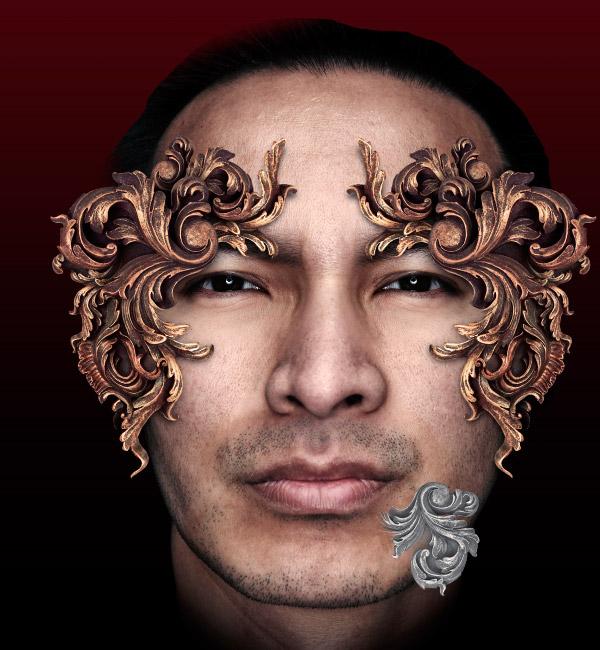
Step 48
I felt that I was getting near the end of the image now so started dealing with small tweaks. I added some tracery to the cheeks using the same highpass method. I cloned out the blob on the very bottom of the jewel, and added a couple of dashed lines above each eye. These were actually imported from Illustrator as dashed strokes are one of its default options. For people without Illustrator I have another very old tutorial that can help replicate the effect in Photoshop: Dashed stroke.
Step 49
For some final details, I wanted to add some actual petals in. I found this photo of a lotus, although since these were going to be very small details, I didn’t look too hard. Any old thing would have done here.
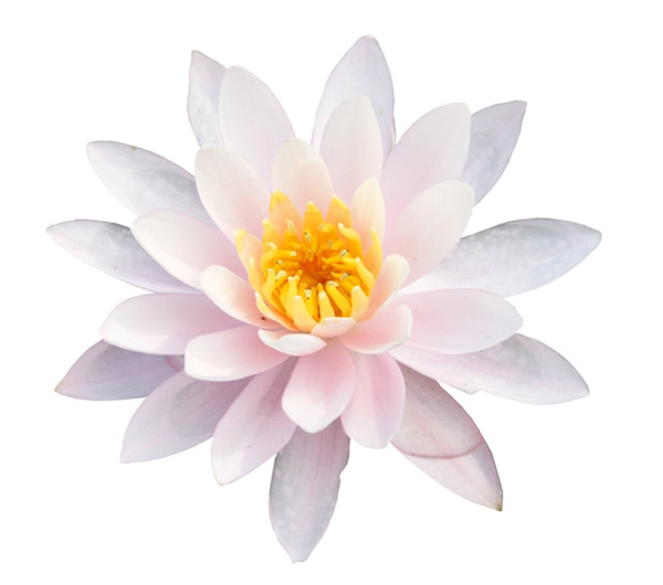
Step 50
I extracted the flower, darkened it considerably using a curves adjustment, and added a fair amount of yellow and red using a color balance adjustment. This was to make sure the petals didn’t stand out too much, and that they blended in with the rest of the design. A simple drop shadow layer style was fine for the shadows. I then placed the flower between the face and the frame layers, duplicated, transformed, and moved them a few times into various positions.
Step 51
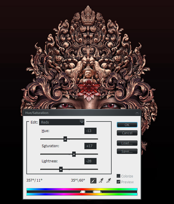
The jewel had been standing out too much for me at this point, so I darkened it heavily with a gradient map adjustment that goes from dark blue to white and faded to a soft light blending mode and low opacity. I then boosted the reds slightly using a selective hue/saturation adjustment, which defined the exact range of colors to affect using the sliders at the bottom.
Step 52
I felt that the image was nearly done by now, so decided to start work on the background. I wanted this to be very minimal so as to not distract at all from what I had done so far. I decided I wanted a starburst style effect, but rather than use any of the normal techniques I decided to experiment and come up with something newer. The first thing I needed to do was to get a flat copy of the image, so I flattened it, and copied this to a new document (making sure to undo the flattening to the main picture afterwards).
I had an idea that involved isolating the details of the image and then using them to produce a burst. As before, a highpass was the best way to isolate these details.
Step 53
I was trying to produce a selection based around just the edges of the image, so I needed to copy this filtered image into a new channel. The next step was to make sure that most of the image wouldn’t be selected, i.e. it would be black in my channel. Using the set black point dropper in the curves palette, I moved everything except the lightest shades to black. I then smoothed some of the noise out by running it through a low setting median filter, and then reset the white point as the median had reduced the contrast too much.
Step 54
This is where I used a function of Photoshop that is rarely touched on, but can be very useful in certain circumstances. I got a selection from my custom channel, and then used the Make work path from selection function in the paths palette. I now had a very complex path based around the high contrast areas of the image.
On a new layer I then stroked this path with a normal round hard brush, making sure that spacing was set to 1%, and simulate pressure was ticked in the stroke sub menu. I now had many squiggly shapes on this new layer. Fine so far but nothing like a starburst.
Step 55
To turn this into more interesting shapes I needed to duplicate this layer a number of times, while increasing the size slightly each time. The easiest way to do repetitive changes like this is to use a custom action. I recorded an action which duplicated the current layer, increased its size to 100.5%, and decreased its lightness slightly. I then hit the play button on this action about 25 times to produce the starburst.
To be honest there are many ways this effect could be produced, this is just what I came up with on the spur of the moment. This is a bit more interesting than your usual radial blur/polar coordinates methods though.
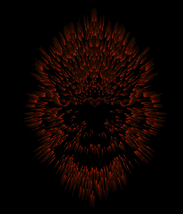
Step 56
I stamped all these duplicated layers into one (select all layers, CNTRL + ALT + E), and copied and pasted back into my main document just above the background layer. I increased its size slightly, so it wasn’t completely hidden, and roughly aligned it with the head.
Step 57
To add a bit of interest into the background, I introduced some elements from a new photo, this time from Stock.xchng. After setting the black point darker, so only the bright sparks were visible, I desaturated it slightly, and changed its blending mode to linear dodge.
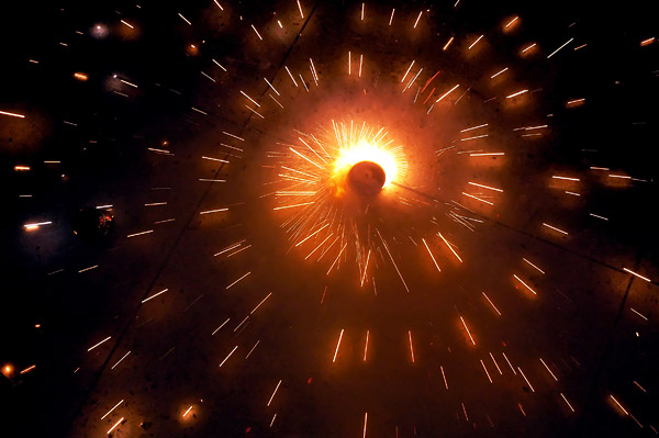
Step 58
I then placed a few different copies around the image, so that some sparks shot out from different parts behind the head. I masked off any sharp edges using a normal layer mask. I used a soft brush on another layer with a screen blending mode to add a bit more light. Then I placed a color balance adjustment layer above all of these new background layers to add some more magenta into the mix.
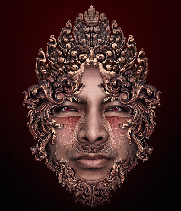
Step 59
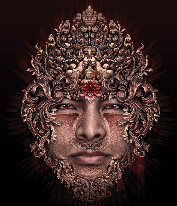
At this point I was definitely fed up with the image and wanted to get it finished; So, I made the final few tweaks before flattening down. I added a few tiny skulls into the crown to cover up some relatively blank areas, and messed about the with lighting distribution of the background, nothing major.
Step 60
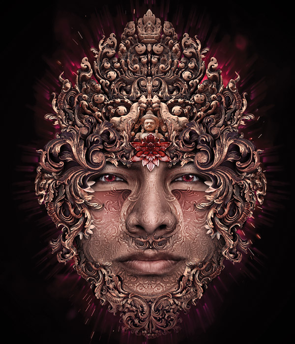
Flattening down at the end of an image is an important step, and not just for saving a flattened version. It allows you to affect changes that would be almost impossible (not to mention incredibly time-consuming) on a layered file. How much or little you do on any particular image will vary hugely depending on what effect you are after. I will describe what I did for this image though.
After flattening and copying the image into a new document (always best to do this just in case you accidentally save over your layered file), I first zoomed in and looked for any small details that needed fixing. The clone and smudge tools can be used in cases like this to quickly fix any small problems, jagged edges, or the like. In this case, I needed to do very little.
Next came the lighting and color fixes. First, I ran an auto-levels adjustment on the whole image, and faded this to 50%. This helped unify the colors, removing some of the yellow tinge, and increasing the contrast slightly. The next step involved blurring, so I first ran a light unsharp mask (30, 1.0, 0 is good for an image this size) on it first.
I then ran a lens blur over the whole image with a setting of about 30 pixels. If you can’t be bothered to wait for a lens blur in cases like this, as it can take ages, a Gaussian or box blur is fine. I then faded this to soft light blending mode with an opacity of about 30%. This gives the whole image a softer, more ethereal feel, as well as giving the contrast a bit of a dramatic boost.
Next I added some soft highlights using a similar method. First, I duplicated my image. Then I ran another lens blur on it, but this time faded to a linear dodge blending mode with an opacity of about 15%. I didn’t want these highlights everywhere, so I then added a reveal none layer mask. Using a white to transparent radial gradient and soft brush, I then added white to the mask where I wanted the image to shine a bit more. In this case, I wanted it to shine around the eyes and center of the face.
That’s pretty much it. All I needed to do then was run another unsharp mask to bring some of the details back out that all that blurring had dulled. To produce a web resolution version, I simply shrank the image down and ran another unsharp mask, but making sure the radius was set to 0.6 pixels, rather than 1.