How To Create The Expendables Winged Skull Poster Art
When I saw the bad-ass poster design for the upcoming movie The Expendables, I just had to open up Photoshop and have a go at recreating it. Follow this step by step guide on how to create the menacing winged skull design for yourself, complete with an overkill of weaponry surrounding a sinister looking skull face.
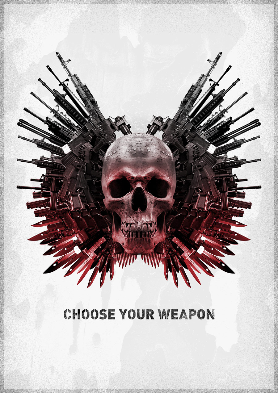
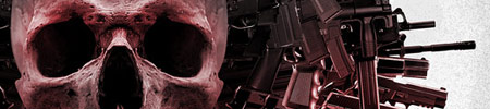
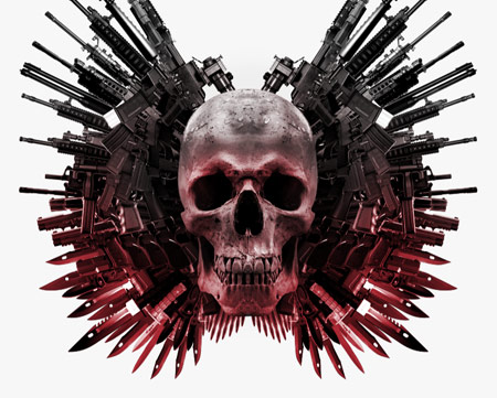
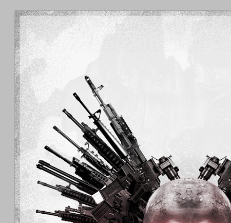
The design is a homage to the original The Expendables poster. It features a sinister skull surrounded by an array of rifles, pistols, knives and bullets which form a pair of detailed wings. The Expendables movie itself looks just as bad-ass! It pays tribute to the action movies of the 80′s and early 90′s and star just about every action movie veteran there is.
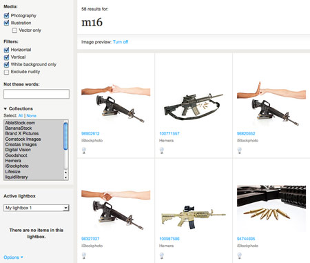
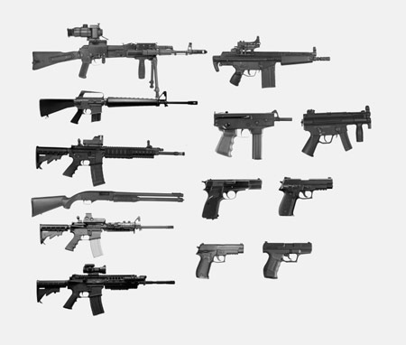
Unless you have Rambo’s armory in your garden shed, the first step to creating this design is to scour the web for stock photos of various weaponry. Most of the items I found were sourced from ThinkStock, with inspiration being taken from the IMFDB (Internet Movie Firearms Database) by searching for the weapons used in your favourite action movies. What about Commando, Rambo, or Predator?
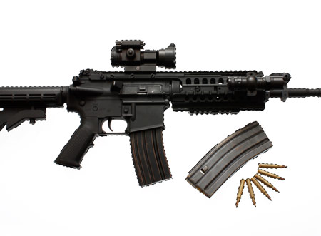
Once you’ve built your arsenal, open up the shots in Photoshop. With the images being high resolution and set on white, we can cheat by using the Magic Wand to select the background, then inverse the selection (CMD+Shift+I).
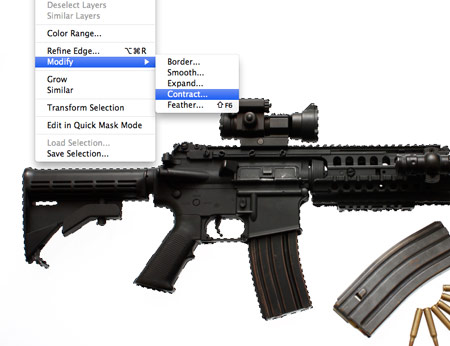
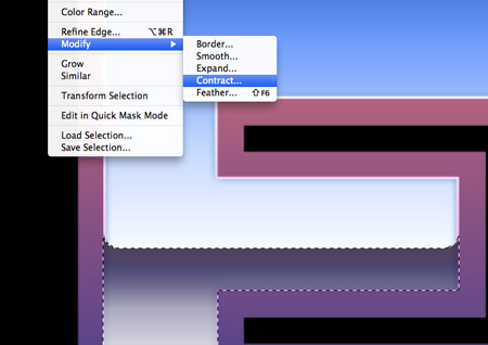
To prevent a white outline appearing around the weapon when clipped out, go to Select > Modify > Contract and enter 2px. Copy the selection and paste it into a new document.
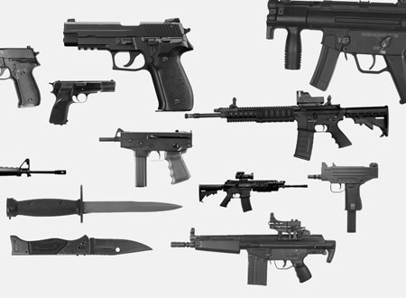
Cut out each weapon from your collection and paste it into the temporary document. Quickly remove the colour from the photos by hitting CMD+Shift+U.
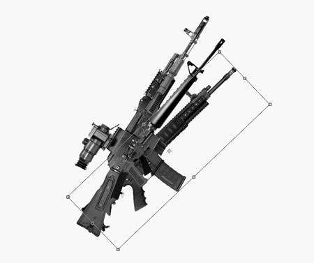
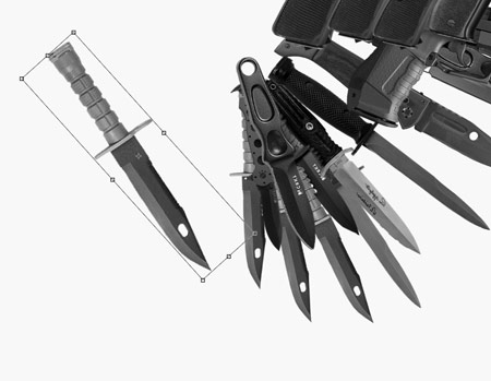
Some photos will be larger resolutions than others, so scale the weapons down so they’re all roughly in proportion to each other.
Hold ALT and drag the largest weapon from the collection to make a duplicate. Rotate this object to produce the first of the ‘primary feathers’. Repeat the process with the other rifles, rotating them so they start to form a flaring wing shape.
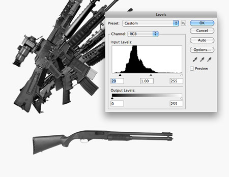
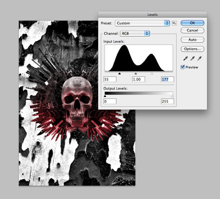
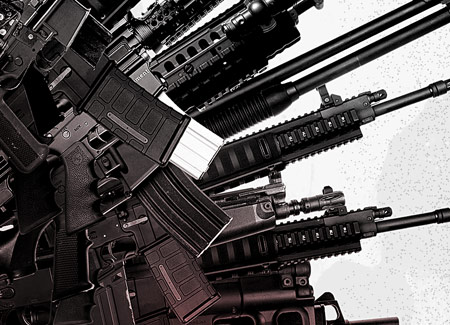
Some of the photos will have high contrast, while others won’t. Adjust the Levels (CMD+L) of the images as you go.
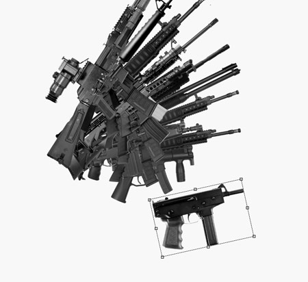
Work down in size through the rifles onto the handheld weapons. Remember to ensure the layers are stacked sequentially, so each additional item goes underneath the rest.
When working with pistols, use duplicates to fill out the inner area of the wing. Remember to keep following the angle so the objects are flaring out from a centre point.
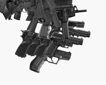
To fill out any large gaps in the design, use another rifle graphic and send it to the bottom of the layer stack. The large body fills out the inner area of the wing while the barrel protrudes out to give the impression of another feather.
Once all the firearms have been used, move onto knives and bayonets near the bottom of the wing. These items can be laid out in a typical feather-like pattern by creating layers which overlap each other.
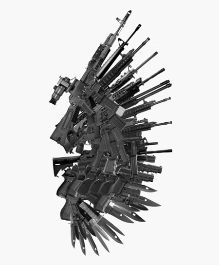
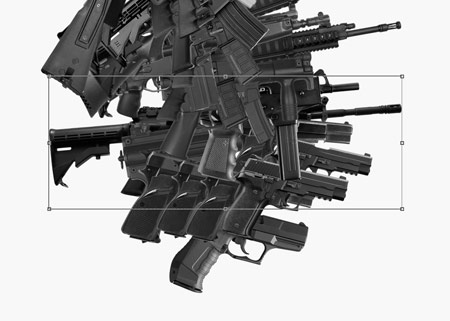
Make duplicates to fill out any gaps in the design and make any adjustments to the angles to give that realistic wing appearance.
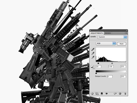
Add a Levels Adjustment Layer to darken the objects and increase the contrast.
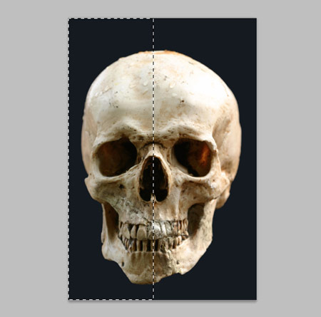
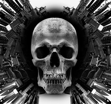
Next we need a skull image for the centre of the design. This particular shot was sourced from ThinkStock. The photograph isn’t quite square on, so make a selection across the first half of the design, copy (CMD+C) and paste (CMD+V).
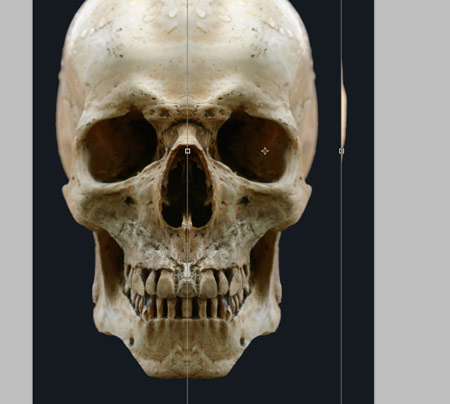
Press CMD+T to Transform, then right click and select Flip Horizontally. Move this copy over to the right side and line it up with the original.
There will be a line down the centre of the image where the two parts are joined, so add a Layer Mask and softly erase out portions of the design to remove this connecting line and to remove any obvious duplications of flaws or textures in the skull.
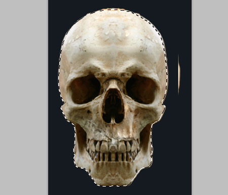
Draw a path around the outline of the skull with the Pen Tool, right click to make a selection then copy it ready for importing into the main document.
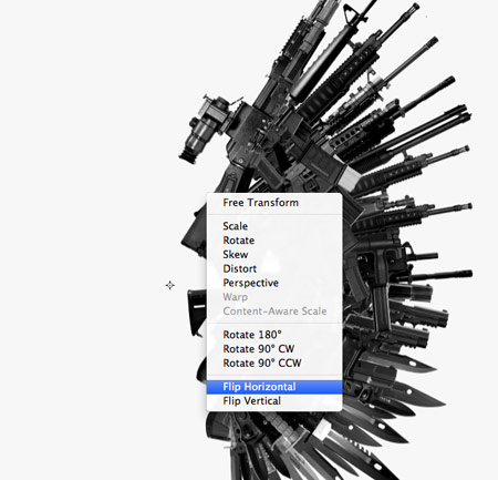
Group all the objects that make up the first wing, then duplicate and Flip Horizontally.
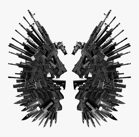
Move the duplicate to the left side of the document and align both wings centrally on the design. Make adjustments to the canvas size to create a typical poster size.
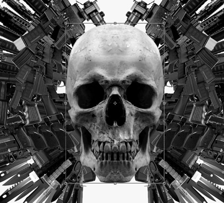
Paste in the skull graphic, then scale and position it to sit in the centre of the two wings. Remove the colour by desaturating the layer (CMD+Shift+U).
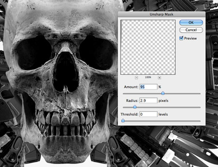
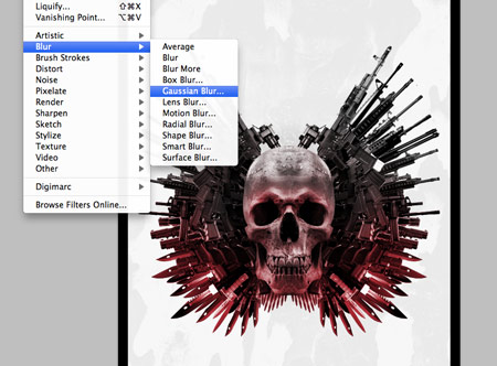
Go to Filter > Sharpen > Unsharp Mask to bring out the details of the skull to match the level of detail in the series of weapon graphics.
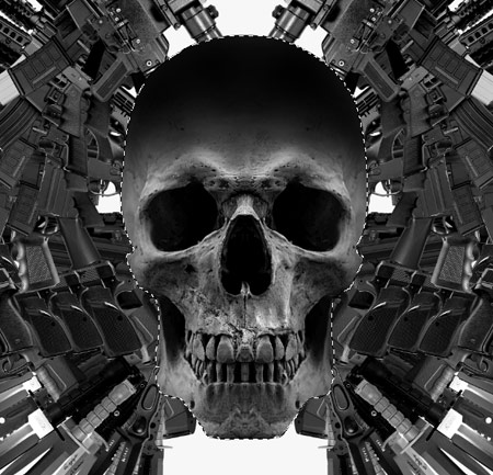
Add some dabs of black with a soft brush to the upper portion of the skull. CMD-Click the skull layer thumbnail, inverse the selection (CMD+Shift+I) and delete out the excess. Change this layer to Soft Light.
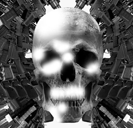
Next, add a series of highlights using a white brush. Load the selection from the skull layer to delete out the excess, then change this layer to Overlay and reduce the opacity to around 30%.
On a layer underneath the skull, but above the wings, paint an outline of black with a soft brush. Change this layer to Soft Light.
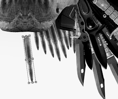
Import an image of a bullet, cut it out and begin positioning duplicates of the object to form a series of smaller feathers on the underside of the skull.

Group the collection of smaller feathers, then duplicate and flip horizontally. Move them into place on the opposite side of the design.
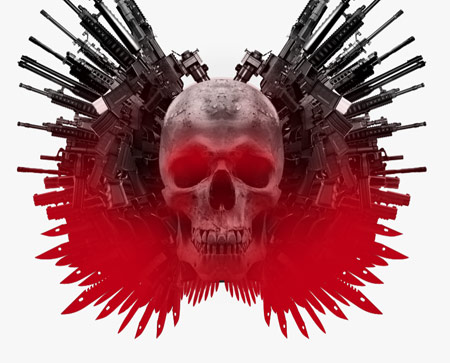
Use a soft brush to paint an overlay of red across the lower portion of the design. Confine this to the outline of the design by loading selections from the layers. Tip: I duplicate the groups then flatten the layers so I have a temporary layer that can be used for loading masks of the complete design.
Change the blending mode of the red layer to Overlay at 70%. Use a Layer Mask to erase out portions of red around the skull to give the impression that the light is being cast from below.
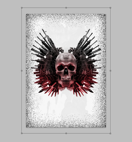
Import a rough texture into the background, desaturate (CMD+Shift+U) then increase the contrast using Levels (CMD+L). Reduce the opacity to around 5%.
Press CMD+A to load a selection, then right click and select Stroke to add a 100px black outline. Blur this outline into a vignette with a 250px Gaussian Blur.
Change the layer style of the vignette to Dissolve, then merge (CMD+E) the layer with a blank layer to rasterize the effect. Transform (CMD+T) and scale the vignette outwards slightly so it just creeps in from the edges.
Give the vignette an opacity of 50%, then add another 50px stroke and give this a blending mode of Overlay.
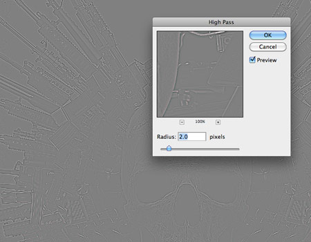
Press CMD+A to Select All, then CMD+Shift+C to Copy Merged. Paste this layer at the top of the stack then add a High Pass filter (Filter > Other > High Pass). Change this layer to Linear Light and tone down the opacity to around 50%.
This High Pass layer does a great job of bringing out the tiny highlights and details from the weaponry and the texture of the skull.
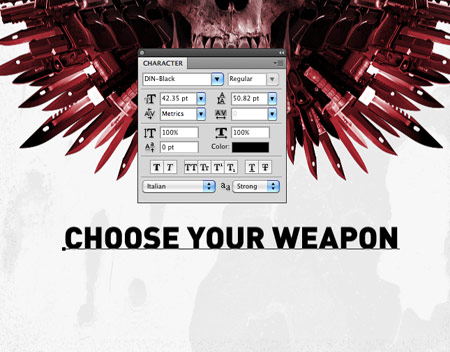
Finish off the poster with the “Choose your weapon” tagline centred up below the main skull graphic. Right click the text layer and select Rasterize Type.
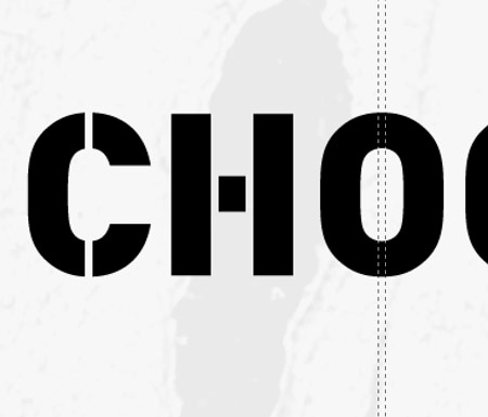
Give the text a stencilled appearance by deleting out a thin selection from each letter.
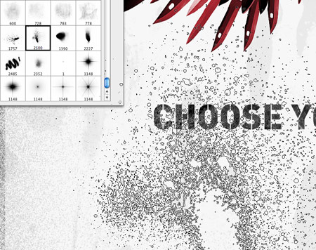
Rough up the text using a Layer Mask and a range of splatter and spray brushes. Lower the opacity of the brush to generate a range of tones and textures.


